Centum WP Documentation
Thank you for purchasing my theme. If you have any questions that are beyond the scope of this help file, please feel free to email via my user page contact form here or submit ticket on purethemes.ticksy.com . Thanks so much!
| Created: | 2012-10-16 |
| Modified: | 2013-08-14 |
| Current Version: | 2.0.8 |
| Documentation Version | 1.1.5 |
Getting started
I assume you have your own WordPress installation, so let's get started!
Installation
You can do it in two ways:
- FTP Upload: Unzip the “centum-theme.zip” file and upload the contents of this zip to the /wp-content/themes folder on your server.
- Wordpress Upload: Navigate to Appearance Add New Themes Upload. Go to browser, and select the zipped theme folder. Hit Install Now and the theme will be uploaded and installed.
Once the theme is uploaded, you need to activate it. Go to Appearance Themes and activate your chosen theme.
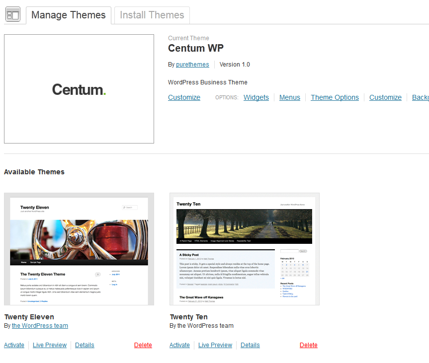
Activating Theme Options
After activating the theme, you will notice under Appearance menu new submenu Theme Options. You'll find there Theme Options Panel, from where you can do a lot of cool stuff. Every section of Theme Options Panel will be described later.

Now open this Options Panel and hit Save button - it will set some options for the start.
Installing and activating Plugins
After activating the theme, you will notice yellow box under header saying which plugins need to be installed and activated. Just click Begin installing plugins and follow the instructions.

Now open this Options Panel and hit Save button - it will set some options for the start.
Importing Demo Contet
If you want to have the same content on your website as Live Preview of Centum theme, you'll need to import demo content. To do that please go to Tools Import WordPress, install plugin you'll see and than select file "extras/import.xml" from Theme Package.
If you don't want to import whole data, in "extras/layouts" you'll find txt files with code from Live Preview. You can choose for example home1.txt, copy whole content of that file, than create new home page on your WordPress, paste it in HTML view, and start working on your page based on this layout.
Notice All photos included with import file are just plain gray color, as they are copyrighted files purchased on PhotoDune. If you want to use them, list of links is at the end of this documentation.
If your import was successful, please go to Appearance Menus and in Theme Locations select "Menu", than save.
Setting up the static homepage
First you have to create a basic page, and select page template named "Home Page Template". Now you can fill it with your content and publish. Next, create another basic page with no content and no template, name it Blog.
After that, go to Settings Reading and in the Front page displays choose A static page, then select your just created page Home.
For blog page you can select your page named Blog. Click Save Changes
Next, you should setup your permalinks to look pretty. You can go to Settings Permalinks, choose the Custom Structure, and use this: /%category%/%postname%/
Setting slider Flexslider
This theme has two types of slider. First is based on FlexSlider by Woothemes, second is Revolution Slider by themepunch. With Flexslider you can use slides based on a image&text column layout, it's light, simple, elegant and fast. Revolution Slider is a little bit heavier and harder to configure but gives you opportunity to create amazing animated slides from images and videos.
To create slides for FlexSlider you need to go to Appearance Theme Options Slider and click Add new

You need to upload a backgroud to each slide, by default it should be 940x400px. The title is not required, if you won't put any text in title and description you'll see just an image, otherwise the content will be displayed in semi transparent black box.
To create slides for Revolution Slider you need to go to Revolution Slider and create new slider. Detailed howto for this is in next section
When you decide which slider to use, go to Theme Options and selecet Enable slider and choose name of script. If it's RevoSlider, put alias to field in Theme Options. Now, you'll see that slider on your homepage.
Revolution Slider
You can find Revolution Slider at the bottom of the WordPress Menu.
After pressing the Create New Slider button you will see a form where you are need to enter a Slider Title and a Slider Alias (a slug that is used to display the Slider in this theme, try to keep it simple, no spaces and special chars).
The options in the boxes on the right side (General Settings, Position, Appearance, Navigation, Thumbnails) have helping Tooltips on mouseover so they are not explained here.
Set the slider exactly like on this screenshot:

The Sizes section is needed to fit the slider in all screen sizes needed. The height of the slider will always be calculated to keep the aspect ratio from the max width and height given in the Slider Size line.
Slides
The next step is creating/editing slides. You get there by just clicking on Edit Slides in the Slider Form window.
Just press "New Slide" and the native WP Media Upload dialog window will appear. Choose or Upload the slide's background image, choose "Full Size" and then "Insert Into Post"
Use the arrow handles on the right side to change the slides position in the slider (top to bottom = first to last slide to be shown) or delete it with the "Delete" button.
The "Edit Slide" leads you to the next chapter "Slide".

Slide & Layers
In the Edit Slide view you see the heart of our plugin. The drag&drop Caption editor.
But first please note that you have another chance here to change the background image with the "Change Image" button.
To create a Layer (Caption, Image or Video) press the button "Add Layer" or "Add Layer: Image". In case of a text layer a basic layer will be created you can use the "Text" field in the Layer Params to change the caption on it. The "Style" selectbox shows some basic styles (CSS classes) you can use to style the caption (you can always add own CSS classes to this field or edit the existing ones via the "Edit CSS File").
In case of an Image Layer you will see the native WP Media Uploader again. In case of a Video Layer you will prompted to a custom Video selection wizard.
You now can move the Layers around via drag&drop or type in the x and y coordinate in the corresponding fields.
The "Layers Sorting" drag&drop list determines the Layers' z-index. This list specifies the stack order of an element.
An element with greater stack order is always in front of an element with a lower stack order.

Here's example code for text layers from Demo of Centum Theme
| Slide | Code |
|---|---|
Slide 1 semitransparent_black_box |
<h3>This is a caption</h3> <p style="padding-top: 10px;">Donec scelerisque aliquet mi, non venenatis urnas<br/> iaculis. Utea id nila ante. Cras est massa, interdum<br/> ateal imperdiet etean, gravida eu quame. Aeneana <br/>volutpat hendrerit posuere.</p> |
Slide 2 semitransparent_black_box |
<div style="display: block; height: 400px; padding: 4px 8px 0 8px; "> <h2> Powerful Theme <br/>You’ve Been<br/> Waiting For, Seriously! </h2> <p>Donec scelerisque aliquet mi, non venenatis urnas<br/> iaculis. Utea id nila ante. Cras est massa, interdum<br/> ateal imperdiet etean, gravida eu quame. Aeneana <br/>volutpat hendrerit posuere.Aliquam rutrum mattis <br/>mollis. Vestibulum a pellentesque tellus.</p> </div> |
Slide 3 semitransparent_black_header |
Modern & Clean Design |
Display Revolution Slider
To display slider on homepage, go to Theme Options - Slider tab, select Revolution Slider, and paste below alias of your slider. Just how it's done on screenshot below:

If you want to display Revolution Slider on any other page, set settings on page like on this screenshot

If you want to show slider in any other place add to php file:
<?php putRevSlider("alias"); ?>
From the widgets panel:
Drag the "Revolution Slider" widget to the desired sidebar
From the post editor:
Insert the shortcode from the sliders table - Example:
[rev_slider example1]
Setting up the menu
This theme uses WordPress 3.0 Custom Menus. Go to Appearance > Menus and you will see a panel where you can create new menus. Create one, add your created pages to it(from the left side panels) and save it. After this, in the left side you have a Theme Locations drop down box where you can select the Menu. Choose your newly created menu, click Save and your menu is ready.

Creating Content Post, Pages and Portfolio
Post
Creating posts is nothing new if you have even basic experience with WordPress. Centum theme offers couple of additional options in Post editor.
Below Editor you'll see Layout box and Post options box.
Layout box

Layout box gives you ability to select sidebar to display with post or page, and also select layout of post - you can put sidebar on left or right side. Right side is default.
You can create more sidebars in Theme Options in Sidebars section. Just follow instruction there.
Post options

You can choose here post display type. There are 2 options:
- Show thumbnail - you need to first upload image to post and select it as a Featured Image using one of the boxes below. Click on “Set featured image” to upload a preview image for this post or select already uploaded image. Then click “Use as featured image”.
- Hide thumbnail - even if you've selected featured image you can hide it - that way the thumbnnail will be used in widgets or in homepage "recent on blog" section, but it won't take space on your blog
If you want to use shortcodes in post content, you need to write the excerpt or you might see non parsed shortcodes in search results or in front page.
Post types

Centum support 3 types of posts. You can change them in right side box. Default is Standard - that one shows single image if it has any Featured Image. The Video post will display video if you'll fill Video URl option, and Gallery type will display ALL images attached to the post in flexslider
Pages
Pages have the same option for Layout like posts. Additionally you'll also find box with Subtitle field and box where you can select slider Alias for Revolution Slider. Keep in mind that this will only work when you have selected Page template "Page with Revo Slider" for this slider.
List of page templates:
| Template name | Description |
|---|---|
| Home page | Full width page with slider selected in Theme Options |
| Full width page | page without sidebar |
| Portfolio page 2 columns | page to list portfolio items in 2 columns |
| Portfolio page 3 columns | page to list portfolio items in 3 columns |
| Portfolio page 4 columns | page to list portfolio items in 4 columns |
| Flexslider full width | Full width with flexslider |
| Flexslider page with sidebar | Flexslider with sidebar |
| Revolution with sidebar | Sidebar page with Revolution Slider, don't forget to put alias below |
| Revolution full width | Full width page with Revolution Slider, don't forget to put alias below |
| Portfolio page 2 colums + content | page to list portfolio items in 2 columns and display content of page before |
| Portfolio page 3 colums + content | page to list portfolio items in 3 columns and display content of page before |
| Portfolio page 4 colums + content | page to list portfolio items in 4 columns and display content of page before |
| Portfolio page 2 colums + Flex Slider | page to list portfolio items in 2 columns and FlexSlider |
| Portfolio page 2 colums + Rev.Slider | page to list portfolio items in 2 columns and Revo Slider |
| Portfolio page 3 colums + Flex Slider | page to list portfolio items in 3 columns and FlexSlider |
| Portfolio page 3 colums + Rev.Slider | page to list portfolio items in 3 columns and Revo Slider |
| Portfolio page 4 colums + Flex Slider | page to list portfolio items in 4 columns and FlexSlider |
| Portfolio page 4 colums + Rev.Slider | page to list portfolio items in 4 columns and Revo Slider |
Portfolio templates Options

If you'll select ono of "portfolio" templates for page, you can configure it using this Options box.
- You can select filters by clicking checkboxes from which you want to compose Portfolio page - thanks to this you have now option to build many portfolios, not only one
- You can decide if you want to display (which is default) or hide buttons to filter portfolio items.
- Custom title for Portfolio, by default it's taken from Theme Options, but you can customize it here per page
Portfolio
Portfolio is similar to posts. You can create portfolio item which will feature gallery of your images, or video clip. Fill the content ( by default it's 12 columns wide). Gallery will be created from all photos added to portfolio item, and don't forget to set Featured Image.
Ideally images for portfolio should be 940x473px, . Smaller images won't look good.
WordPress will try to resize images you're uploading, that may result in not the results you want. If you'll notice that, the best option for you is to prepare images in exactly the size you want (but width should be minimum 940px), and change in single-portfolio.php line 80 to $thumb = wp_get_attachment_image_src($image->ID, 'full');
Now you have couple of custom options. First you can put subtitle to the Item name.
You can also switch gallery to Video, then just paste URL to the clip and it will be displayed in place of gallery slider. List of supported sites is here http://codex.wordpress.org/Embeds
By default content for text under portfolio item is 12 columns. In first 4 columns you can show informations like Date, Client name and link to Launch button. You need to first setup this fields in Theme Options. If you don't want this informations to be displayed, you can switch content width to Full - than it will be the same as Full width page, so 16 columns.
Portfolio meta informations

You can display 4 types on information for Portfolio item. "Text" and "Link" types values can be edited for each portfolio, "Filters" will display all filters selected for currently viewed portfolio and "Date of publication" is self explanatory :)
If you've updated theme from version prior to 1.5, you need to add this fields to Portfolio Meta Informations:- Date - type "Text"
- Client - type "Text"
- Launch - type "Link to project"

If you'll upload images to your Portfolio Item, here you can select which one you'd like to exclude from slider (because for example one is smaller size specially for thumbnail, or some other image you want to put in conten)
Portfolio filters
Filters acts like categories - you can add one portfolio item to many filters.

Shortcodes & Widgets Configuration
Centum has many shortcodes which will help you to build awesome layouts. In "extras" folder you have sample layouts saved as text files, so you can just copy them to your Editor and use them as a base for your site.

Here is list of all shortcodes as they appear in editor:
Headline shortcodes:
[headline margin="no-margin" htype="h4"] Text [headline]
This will create H4 tag styled for nice start of paragraph. Use it a lot as it gives nice feel to content.
Options- margin "no-margin" (default), "low-margin", "margin"
- htype "h4" (default), "h3"
Columns shortcodes:
Centum is based on Skeletons grid - Full width page has 16 columns, if it's page with sidebar it has 11 columns. Using columns shortcodes you can build your own layouts. You have also some preset layouts like:
You should use Columns Creator but it's easy to this shortcodes by hand. Look closely at this shortcode, the important part except the width is place. You have 3 options here - first, none or last. If last is used, it's assumed that this column is last in current row and floats will be cleared. First will set margin-left to 0px. If you have more than two columns you might want to use also place="center" - it will set margin left and margin right to 0px. It's good to try different parameters to find out what looks the best in specific situation.
[column width="1/3" place="first" ] Put here content [/column] [column width="2/3" place="last" ] Put here content[/column]
- width "sixteen" (default), "fifteen", "fourteen", (..), "two", "one"
- place "first" (default), "center", "last", "none"
- custom_class
You can use other shortcodes in columns, you can even use nested columns if you want.
Button shortcode:
[button size="small" color="green" url="#" icon="icon-ok" iconcolor="white"] Text [/button]
- size "medium" (default), "small"
- color "color" (default), "gray"
- customcolor "#000000" (any color hash)
- iconcolor "white","black"
- icon glyphicon name
Tabs shortcode:
[tabgroup] [tab title="Tab 1" icon="icon-star"] Aliquam egestas consectetur elementum class aptent taciti sociosqu ad litora torquent perea conubia nostra lorem inceptos orem ipsum dolor sit amet, consectetur adipiscing elit.[/tab] [tab title="Tab 2"] Lorem ipsum pharetra felis. Aliquam egestas consectetur elementum class aptent taciti sociosqu ad litora torquent perea conubia nostra lorem inceptos orem ipsum dolor sit amet, consectetur adipiscing elit.[/tab] [tab title="Tab 3"] Lorem ipsum pharetra felis. Aliquam egestas consectetur elementum class aptent taciti sociosqu ad litora torquent perea conubia nostra lorem inceptos orem ipsum dolor sit amet, consectetur adipiscing elit. [/tab] [/tabgroup]
You can add icons to tab by using parameter icon. Whole tab section must be in [tabgroup] shortcode.

Accordion shortcode:
[accordion title="Accordion#1"] Lorem ipsum dolor sit amet, consectetur adipiscing elit tortor libero sodales leo, eget blandit nunc tortor eu nibh. Aenean nisl orci lorem, condiment ultrices consequat eu lorem ipsum dolor sit amet inventore veritatis et quasi architecto beatae vitae dicta sunt explicabo dolor sit amet.[/accordion][accordion title="Accordion#1"] Lorem ipsum dolor sit amet, consectetur adipiscing elit tortor libero sodales leo, eget blandit nunc tortor eu nibh. Aenean nisl orci lorem, [/accordion][accordion title="Accordion#1"] Lorem ipsum dolor sit amet, consectetur adipiscing elit tortor libero sodales leo, eget blandit nunc tortor eu nibh. Aenean nisl orci lorem, [/accordion]
Box shortcode:
[box type=error] Error! Please fill in all the fields required. [/box]
- type "error", "notice", "warning", "success"
Notice shortcode:
[notice title="This is a Headline"]
This is a example of style component for calling extra attention to featured content or information. Adipiscing elit. Cras eu nisl quam. Cras in elit a massa fermentum bibendum.
[button color="color" url="#"] Read More [/button][/notice]
it's good way to show "call to action" buttons and important informations.
Feature box
[feature title="Easy to Customize" icon="http://www.demo.purethemes.net/incredible/wp-content/uploads/2012/08/features_ico_01.png"]Proin iaculis purus consequat sem cursus digni ssim. Donec porttitor entume suscipit. Aenean rhoncus posuere odio in tincidunt.[/feature]
Feature box looks the best in 3 columns row, it gives nice icon to get attention of user, you can use e.g. it to list features of your products. There is list of icons you can use, but you can also add your own icons using icon parameter with URL to the image.

List styles
[list type=star_list]
  <ul>
    <li> list item </li>
    <li> list item </li>
 </ul>
[/list]
- type "star_list", "check_list", "plus_list", "minus_list", "star_list", "arrow_list", "square_list", "circle_list", "cross_list"
Also available from TinyMCE gives you option to use nice list bullets.
Slideshow shortcode
[pureslideshow] URL_To_Photo1;URL_To_Photo2 [/pureslideshow]
You can use simple flexslider gallery to show your photos, for best effect they should be the same size, just add URL to each photo and ";" at the end of each.
Social Icons
[social_icons] [social_icon service="rss" url="URL" ][/social_icons]
If you want to make list of social icons in one row, please add them in
[social_icons]
container.
Pricing Tables
Pricing tables are not available currently from TinyMCE editor.
Sample code for Pricing table:
[pricing_wrapper number="4"][pricing_table header="Standard" price="$9.99" per="per month" color="1" ]<ul>
<li>5 GB Storage</li>
<li>Free Live Support</li>
<li>Unlimited Users</li>
<li>No Time Tracking</li>
<li>Enhanced SSL Security</li>
</ul>
<a class="sign-up" href="#"><span>Sign Up</span></a>[/pricing_table][pricing_table header="Premium" price="$29.99" per="per month" color="2" ]<ul>
<li>5 GB Storage</li>
<li>Free Live Support</li>
<li>Unlimited Users</li>
<li>No Time Tracking</li>
<li>Enhanced SSL Security</li>
</ul>
<a class="sign-up" href="#"><span>Sign Up</span></a>[/pricing_table][pricing_table header="Professional" price="$69.99" per="per month" color="3" ]<ul>
<li>5 GB Storage</li>
<li>Free Live Support</li>
<li>Unlimited Users</li>
<li>No Time Tracking</li>
<li>Enhanced SSL Security</li>
</ul>
<a class="sign-up" href="#"><span>Sign Up</span></a>[/pricing_table][pricing_table header="Maximum" price="$99.99" per="per month" color="1" ]<ul>
<li>5 GB Storage</li>
<li>Free Live Support</li>
<li>Unlimited Users</li>
<li>No Time Tracking</li>
<li>Enhanced SSL Security</li>
</ul>
<a class="sign-up" href="#"><span>Sign Up</span></a>[/pricing_table][/pricing_wrapper]
You need to put all tables in container shortcode
[pricing_wrapper number="4"]
the parameter "number" has to be equal to number of tables you want to display.
Here's one regular column:
[pricing_table header="Standard" price="$9.99" per="per month" color="1" ]<ul>
<li>5 GB Storage</li>
<li>Free Live Support</li>
<li>Unlimited Users</li>
<li>No Time Tracking</li>
<li>Enhanced SSL Security</li>
</ul>
<a href="#">Sign Up</a>[/pricing_table]
What's important here is header, price, per and color parameters.
The colors can be set to 1,2 or 3
Remember that there shoudn't be any white space between closing and opening tag [/pricing_table][pricing_table]
Team shortcode
[team link="http://www.memberpage.com" photo="http://demo.purethemes.net/incredible/wp-content/uploads/2012/08/team_img.png" name="Fred Wallet" job="WordPress Developer" twitter="#" facebook="#" digg="#" vimeo="#" youtube="#" skype="#"] Tempus libero ellus viverra pharetra. Donec commodo gravida velit vel lorem ipsum dolor sit amet euismod. [/team]
Team shortcode is used on About Us page - it gives nicely styled boxes to feature team members of your comapny. Use example as a template for others.
Testimonials shortcode
[testimonials] [testimonial author="Michael" job="Flash Developer"]Posuere erat a ante venenatis dapibus posuere velit aliquet. Duis llis, est non coeammodo luctus, nisi erat porttitor ligula, egeteas laciniato odiomo sem.[/testimonial]
[testimonial author="John" job="Web Developer"] Integer eu libero sit amet nisl vestibulum semper. Fusce nec porttitor massa. In nec neque elit. Curabitur malesuada ligula vitae purus ornare onec etea magna diam varius. [/testimonial] [/testimonials]
This shortcode will display carousel with testimonials. Single testimonial looks like this [testimonial author="John" job="Web Developer"] text [/testimonial]. Whole block of testimonials must be contained in [testimonials] [/testimonials]
Clients shortcode
[clients]
<ul>
<li><img title="logo_01" src="http://www.demo.purethemes.net/incredible/wp-content/uploads/2012/09/logo_01.png" alt="" width="187" height="95" /></li>
<li><img title="logo_01" src="http://www.demo.purethemes.net/incredible/wp-content/uploads/2012/09/logo_02.png" alt="" width="187" height="95" /></li>
</ul>
[/clients]
You can display with this shortcode nice list of logo of e.g your partners, just put list of IMG tags in [clients] [/clients].
Recent portfolio items shortcode
[recent_pf limit="4" fullpage="no" orderby="date" filters='']
You can display with this shortcode you recent portfolios. If items do not align corectly on your page, you can try to set fullpage="yes", you can also change orderby to "rand" to show random items
Recent blog posts shortcode
[recent_blog number="4" fullpage="no"]
You can display with this shortcode you recent blog posts. If items do not align corectly on your page, you can try to set fullpage="yes"
Google maps shortcode
[googlemap width="100%" height="250px" address='New York, United States']
You can display simple google map with address box, if you want something more advanced there are dozens of plugins you could use
Widgets
-
CentumWP Posts
Displays recent posts list with thumbnails -
CentumWP Twitter Widget
Latest posts from your Twitter -
CentumWP Flickr
Displays photos from Flickr

Plugins Configuration
Here's some short info about basic plugins you could use in Centum
WooCommerce
After installing WooCommerce, be sure to go WooCommerce -> Settings and uncheck option "Enable WooCommerce CSS" & "Enable Lightbox".
WP-PageNavi
After installing, go to Settings - PageNavi, and be sure to have checked "Use pagenavi-css.css"
WPML compatibility!
Centum is fully compatible with WPML, which means you can create multilingual versions of your site.
You need to install two plugins from WPML - WPML Multilingual CMS and WPML String Translation. You'll find extensive documentation about using WPML plugin here http://wpml.org/documentation/getting-started-guide/, but you need to know two things about Centum to fully translate it.
Except post pages and other content that is editable from wp-admin, theme has also couple of text string which are "hardcoded" in theme files. Good news, you can translate them also! You just need to go to wp-admin -> WPML -> String Translation, and find the strings you need to translate. The most crucial are this:
 You simply click one and translate it, you need to check the box with "Complete translation" to be able to see it. This way you can translate Centum related Portfolio and Blog page title, copyrights text and FlexSlider slides.
Theme Options
Options panel is based on amazing OptionsTree plugin.
Slider
- Enable slider - or disable slider on homepage
- Select slider for homepage - select which slider to show - RevolutionSlider is created via it's own panel, FlexSlider is created on the screen you are now
- Alias of revolution slider - When you're creating this slider, you need to put it name (e.g. slider1) You need to put it here after that to display it on homepage
- Homepage Flexslider - here you can create slides for Flexslider
General tab
- Upload logo - just select it from your computer or Media Library
- Logo area width - Full width of top area is 16 columns. Logo area by default is 9 columns, while icons and contact details area is 6 columns wide. If you want to have bigger logo, please change here number of columns for logo.
- Logo Top Margin - set top margin of logo image
- Logo Bottom Margin - set top margin of logo image
- Favicon - 16x16 icon
- Header social icons
General II
- Enable contact details in header
- Header minimum height - You can change it to adjust header height - it depends on your logo and contact details settings
- Contact details email
- Contact details phone
- Portfolio options
- Copyrigths text - text in footer
- Custom CSS - if you're not using Child Theme plus put all CSS changes in that box - it will make updates easier.
Typography
You can choose from one of 500+ Google fonts. Select font for body and for headers. You can also just choose some nice font for a logo if you prefer to have text logo instead of image.
Sidebars
All sidebars that you create here will appear both in the Appearance > Widgets, and then you can choose them for specific pages or posts. Please choose a unique title for each sidebar and make it one word.
Theme Customizer
Centum is using new feature of latest WordPress - Theme Customizer, you'll get there by clicking Appearance - Customize

It gives you real time preview of changes you made to your site.
Layout type
In that tab you can change layout to boxed/wide version and colour scheme to dark/light. If you have choosed wide version you won't be able to change background color.Colors
- Background color - can be changed only if you haven't set Background image nad you're using boxed layout
- Main color - Centum is 3 colors design - dark, white and one vibrant color for all elements like active menus, arrows, buttons etc. Here you can change that color and see it live
- Overlay color - Change just hover effect color on items in menu
Background Image
Works only on boxed layout - you can upload any image you want, or switch to default
Contact Page
You should use contact form 7 plugin for contact form. After installing it, go to Contact - Add new (or edit current one) and in Form field paste what's below:
<div class="field">
<label>Name:</label> [text your-name]
</div>
<div class="field">
<label>Email: <span style="color:#e4280f;">*</span></label> [email* your-email]
</div>
<div class="field">
<label>Message: <span style="color:#e4280f;">*</span></label> [textarea* your-message]
</div>

<div class="field">[submit class:button class:medium class:yellow "Send Message"]</div>
Than at the top of page you'll see shortcode, for example:
[contact-form-7 id="503" title="Contact form 1"]Use it on a page you want to have contact form.
PSD Files
You'll find home, blog and portfolio pages in PSD format in "extras" folder.
Translation
You can learn from here about Translating theme into your language.
The .pot file is in 'centum/languages' folder named 'default.pot'.
You can use Poedit to translate the .po file. You need to save it in languages folder, and name just the same way your
language is defined in WP config file. Open wp-config.php and check define ('WPLANG', '');
if it's for example fr_FR, save your .po file as fr_FR.po
Once again, thank you so much for purchasing this theme. As I said at the beginning, I'd be glad to help you if you have any questions relating to this theme. No guarantees, but I'll do my best to assist. If you have a more general question relating to the themes on ThemeForest, you might consider visiting the forums and asking your question in the "Item Discussion" section.